
Generic reviews for rent. Pre-written micro-reviews licensed to any company. Reviewers have never used your product—and that's the point. A Testimoney product.
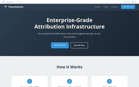
Military-Grade Attribution infrastructure for powered-by labels. 99.99% uptime SLA for your footer text.
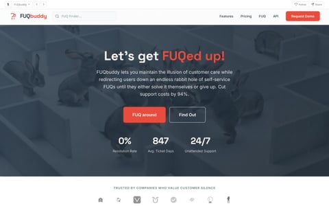
Frequently Unasked Questions. FUQbuddy is the premier hosted FUQ and support platform where customers can find answers to questions they never asked—and never will. Self-service support for the hopelessly self-sufficient.
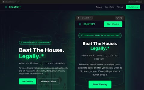
An AI that helps gamblers cheat in casinos, since technically it's only illegal when a human does it.

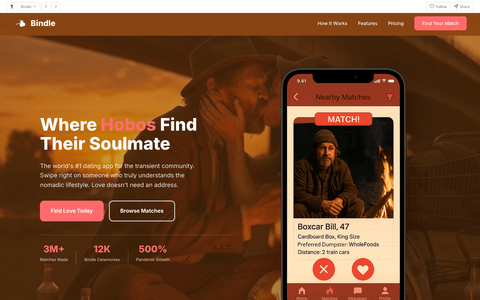
Where hobos find their soulmate.

Poop in privacy with a luxury toilet near you. Download our app to start downing your load.
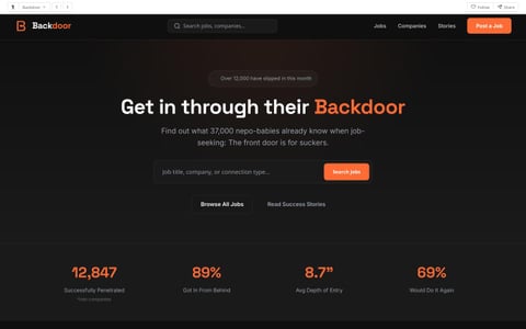
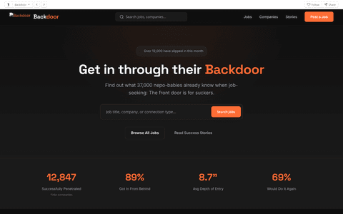
See how people really get hired. Skip the front door and slip in through the back.

 Praisetitute
NEW
Praisetitute
NEW

 Powerbottom
NEW
Powerbottom
NEW

 FUQbuddy
NEW
FUQbuddy
NEW
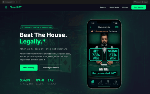
 CheatGPT
NEW
CheatGPT
NEW
 Bindle
HOT
Bindle
HOT

 AirBM
NEW
AirBM
NEW
 Backdoor
NEW
Backdoor
NEW
 101.1 The Butt
AirBM
101.1 The Butt
AirBM
 Alley Wae
 Analies
 Asshology
Backdoor
Asshology
Backdoor
 Balenciaga
 BeatKids
Bindle
BeatKids
Bindle
 BrokeIn
 Carousell
CheatGPT
Carousell
CheatGPT
 Church of the Universal Nomadic Traveler
 Comeo
Comeo
 Cornkast
 Cryer Liars for Hire
 Cunilingo
 Dumpster Dash
 EnableMe
FUQbuddy
EnableMe
FUQbuddy
 GruntGPT
 Gruntslate
 Gutter
 H.O.L.E.
 Handy Jobs
 Incestry
 Informer
 Jail Baste
 Kool Kids Korner
 Lunch Income
 Mid
Mid
 Minor Miners
 OgleMe
 OnlyStrands
 Pawper
 PedroFile
Powerbottom
Praisetitute
PedroFile
Powerbottom
Praisetitute
 Prankcast
 Ruff Translations
 Second Chances
 Shedroll
 Shilling
 ShopLift
 SidePiece
 Sister Grace's Oasis
 Solicit
 Swipe
Swipe
 Take-A-Wish Foundation
 Tattots
 Terminal
 Testimoney
 The Clerkies
 Thots and Prayers
 TinyVag
 Trampaigns
 UnderPass
 V Contaminator
 Vagibond Developers
 Vagibond Eats
 Vagibond Maps
 Vagibond University
 Vagibond Voyages
 Vagicon
 Vagifind
 Vagify
 Vagipages
 Vagrance
 Vibe Raters
 Vmail
Vmail
 Vogue Pervert
 Zilcho
Your numbers are bad. Revenue's down. Users are churning. Your runway is measured in weeks. But your investors don't need to know that. They just need to see a beauitful chart that takes creative liberties to make your growth look explosive. We make that chart.
Every visualization tells a different story. But all the same lie.
This is the graph. This is the only graph. No matter what numbers you give us, this is what comes out. Revenue down? This graph. Users churning? This graph. Negative profit margin? This graph.
The only pie chart in the world that can be divided above 100%
Our bar chart automatically reorganizes any dataset in order of smallest to largest, giving the impression of explosive growth to anyone who doesn't look too hard.
When your growth trajectory needs to defy physics. The loop chart shows momentum so powerful it literally loops back on itself. Perfect for explaining why losing money is actually a feature.
Choose your topology: classic boobs with nipple peaks, thicc butt cheeks, or a bulbous dick chart for maximum market penetration. Whatever shape you choose, the data always looks... stimulating.
A chart with no beginning and no end - just like your burn rate. Watch mesmerized investors follow the infinite extra-dimensional loop of your "sustainable growth model" until they are too mesmerized to ask about unit economics.
Nothing disguises the disappointing trends of a bar chart showing disappointing growth trends, quite like turning them into audio-reactive visualizations that pulse with procedurally generated 8-bit music.
When your numbers are so bad you need to literally draw something else. Our distraction charts let you sketch whatever you want over your data. Puppy? Car? Anatomically suggestive shapes? We don't judge.
An upgrade on the traditional Gantt chart, only way more stimulating thanks to our proprietary Mammary Gland Technology ™, to guarantee investors never switch slides to your financial statements. Our visualization highlights your Totally Awesome Naturals Line (aka your "tanline"). Toggle SFW mode for board meetings. Or NSFW mode while HR is out for lunch.
When all else fails, deploy the ancient art of subliminal messaging. Our hypnotic spiral chart flashes investor-friendly keywords at speeds too fast for conscious rejection but perfect for signing term sheets. INVEST. MONEY. SERIES B. TRUST US. Works on board members, regulators, and that one analyst who keeps asking about "real numbers."
*All visualizations are mathematically accurate. The math just happens to be creative.
Your competitors are already using it. Probably.
Three simple steps to investor confidence.
Revenue, users, engagement, runway - whatever metrics are keeping you up at night. We accept numbers, negative numbers, zeros, and existential dread.
This is the key innovation. Traditional analytics "visualize your data." We skip that step entirely. Much more efficient.
Every time. Same curve. Same trajectory. Same "up and to the right" energy. Put it in your deck. Close your round.
You're going to raise money. We're going to help. Let's not overthink it.
Names redacted for legal reasons.
Right now, while you're reading this, a worse company than yours is closing a bigger round. Why? Because their charts go up. Up yours.
Get Started Free →Free until Series A. Then we talk. You'll have money. We'll have leverage.